
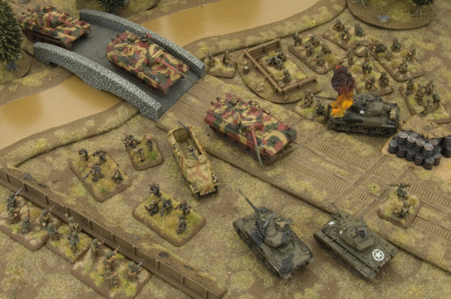
I picked up a few sets of GF9 rivers a while back, and am glad that I did because I understand the 'starter' set with the bridges is now hard to find.

The good:
Sturdy, durable, variety of organic shapes and fords/ island etc., pre-painted but not pre-flocked, decent width/ length
The bad:
Several of my pieces came stuck to one another and were scratched and scuffed. Several other people have had the same issue. Here are the worst:


I initially decided to go with an olive green. When I placed a trial piece on my board, however, it disappeared into the rest of the terrain- I then appreciated the benefits of blue rivers. I have just made a variety of different colours, and appreciate your input:


The good:
Sturdy, durable, variety of organic shapes and fords/ island etc., pre-painted but not pre-flocked, decent width/ length
The bad:
Several of my pieces came stuck to one another and were scratched and scuffed. Several other people have had the same issue. Here are the worst:

Disappointing, but not the end of the world. So I'm going to repaint them- what colour? These pieces will have to stand for a variety of scales and environments, from desert to jungle.
I've never really been a fan of blue rivers and streams. I've seen some lovely model railway scenery with a dark bottle green, and was pleasantly surprised by some of Battlefront's repainted brown pieces:
 |
| Vallejo 921 English Uniform |
I initially decided to go with an olive green. When I placed a trial piece on my board, however, it disappeared into the rest of the terrain- I then appreciated the benefits of blue rivers. I have just made a variety of different colours, and appreciate your input:
 |
| Olive green- looks nice, but blends into the tabletop |
 |
| Blue with pale streaks. Cartoony, and closest to the original paintjobs. Clearly a waterway. |
 |
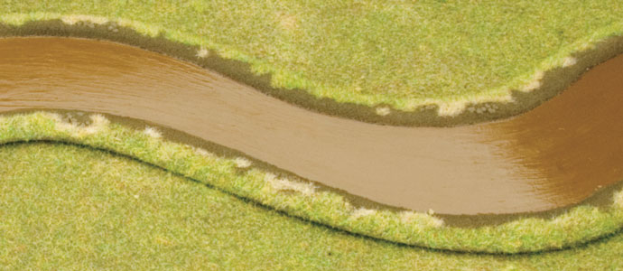
| Flat brown. Realistic but boring, and too much like a road. |
 |
| Bottle green with light green streaks. Too toxic SciFi for my tastes. |
I cant decide between the olive green and the blue. If I do go for olive green, I'm not sure if I should go for a flat uniform coat, or something with a bit more variety in it. I only slapped on a little paint, and the streakiness is somewhat pleasing, if difficult to reproduce consistently. On the bottom two pictures in particular you can see where the factory blue paintjob 'rides up' the banks a little.
The gloss varnish helps, but isn't as glossy as I expected. A few more coats will help. These paintjobs are surprisingly gritty; don't entirely know why. I've have gone for speed over neatness. I've yet to flock and pick out the stones.
On the WWPD site, I found this sneak-peek picture from Battlefront which appears to show a variety of wider and narrower streams and rivers yet to be released. Looks good!

I'm still hanging out for a waterfall piece. Have a look at Eric the Shed's excellent rivers and waterfall! (I note he went for blue, and it looks great.)

I would go with a green / brown combo, and try and grade the colour change lighter near the banks and darker in the middle...
ReplyDeleteWhen done give a coat of gloss varnish for reflection...
IIRC I used the painting guide in GWs "How to make terrain"
I was trying to get away with very simple; but I think the idea of a darker middle bears (ahem) reflection.
DeleteTough call really, blue does seem wrong yet the others also have there issues. hmmm. The flat Brown looks the better of the four but needs a coat of varnish to make it reflective like Scott says.
ReplyDeleteI'm edging away from the flat brown. They all need more varnish, as you say.
DeleteIn a video game I have been working on, I originally made the water green. Blue wound up being better, because it was more obviously water. I do think the darker approach in Eric's photo is better than light blue, and of course, tons of varnish or water effects.
ReplyDeleteI'm also planning (eventually!) to have swamps and rice paddies, and I think that different coloured water will be confusing/ inconsistent. I'm conflicted, but right now I'm thinking green-brown.
DeleteJust noticed that my waterfall and river have made it onto your excellent blog...
ReplyDeletePersonally I like blue rivers plus the vinyl tiles were just perfect...no need for varnish as they already have the glossy shiny surface
Best wishes
Eric the Shed
Cheers Eric, I've always been a fan of your terrain!
Deletethe blue is not realistic but it looks more realistic... (strange impression!))
ReplyDeleteperhaps it's different if the edges are done ?
It's quite the dilemma. I'm only going to flock the edges when I've settled on a water colour, and it will likely have a subtle effect on the overall appearance.
DeleteDid you ever decide?! I'm about to start painting my own river and face the same dilemma...
ReplyDeleteI did indeed, Lee!
Deletehttp://wargamingwithbarks.blogspot.com.au/2013/03/the-essence-of-moisture-is-wetness.html
and
http://wargamingwithbarks.blogspot.com.au/2013/04/how-green-is-my-river.html
I went with the olive green. Whatever colour you use, try not to get it too streaky, and use lots of gloss varnish. I look forwards to seeing how you go!